Logos and Branding Rules
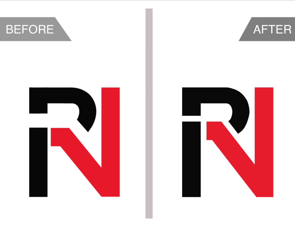
Our logo has evolved through subtle yet impactful updates over time, maintaining the core concept of the integrated “R” and “N” design while enhancing its visual strength and clarity. Initially, the logo’s spacing and alignment posed challenges for consistency across different platforms and media. These aspects were carefully reviewed and refined to create better balance and proportion.
Key Enhancements:
- Improved alignment between the “R” and “N” for a seamless, cohesive look.
- Adjusted spacing to promote better visual harmony and readability.
- Enhanced contrast and color detailing for more defined edges and stronger brand representation.
- Introduced minor structural changes to ensure that the logo maintains its integrity in various scales and formats, from digital screens to print materials.
Each stage of refinement reflects our commitment to perfecting the visual representation of our identity, embodying both the boldness and sophistication that define REVELNATION. As we continue to expand and adapt, our logo will remain a testament to our values, growth, and dedication to excellence.
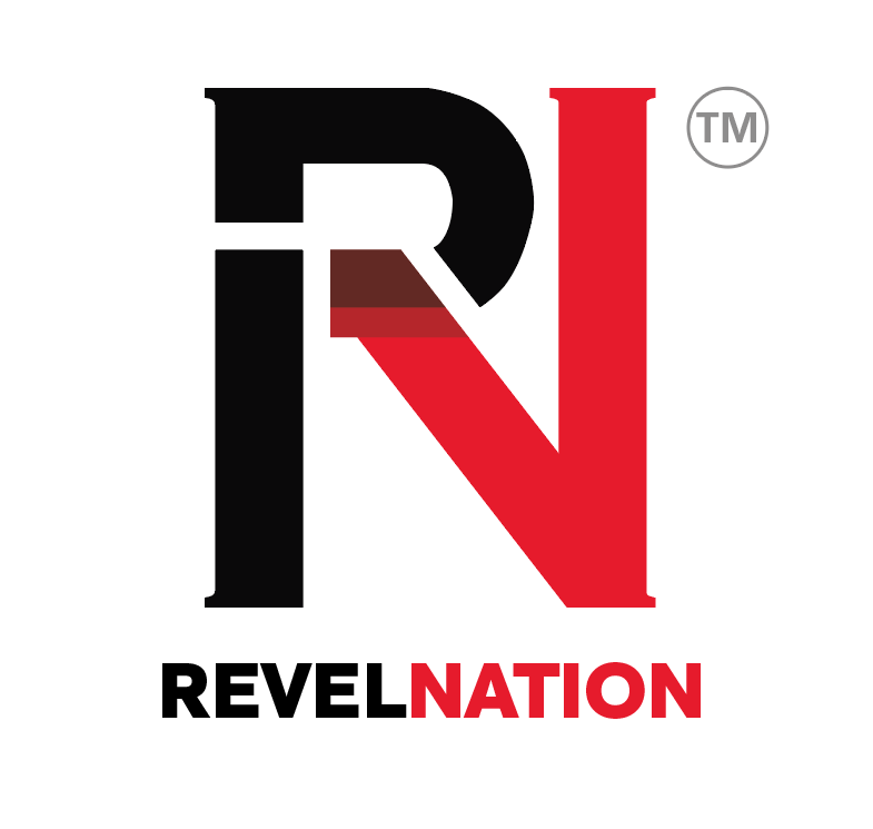
Download our Logos. Click on any of the logos below to download high-quality versions for use in your projects and presentations. Please ensure all branding guidelines are followed.
Our Brand Colors
Primary
Primary Red: #ed2326

Primary Black: #070808

Near-White: #F2EDED

Light Grey: #c9c9c9

Mid Grey: #989796

Secondary
Shadow Red #6E2F26

Shadow Red #C02F2A


